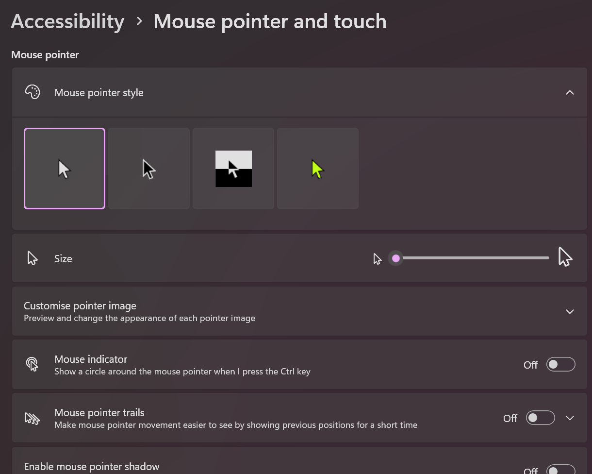
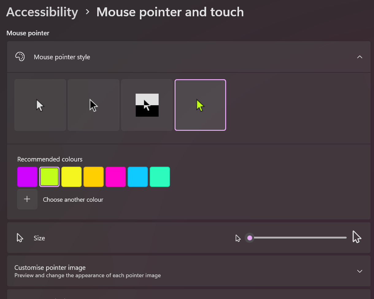
1Open pointer color controls in Accessibility
Go to Settings > Accessibility > Mouse pointer and touch and switch to a custom pointer color option.
Loading...
Neon pointer colors can be practical for visibility when default colors disappear in mixed interfaces. This guide focuses on contrast outcomes and validation, not cosmetic preference alone.
Go to Settings > Accessibility > Mouse pointer and touch and switch to a custom pointer color option.
Test each color in browser tabs, docs, spreadsheets, and editor windows to find the most visible option.

Use the color that stays visible in all key tasks, then re-check only after major monitor/theme changes.
High-contrast pointer colors help when default white/black cursors blend into app content.
Select color by visibility outcome, not by desktop preview aesthetics.
Run tests in the apps you actually use, because each app has different background and contrast patterns.
Keep the option that is consistently easiest to find across those contexts.
Pointer color is a cursor visibility control and can be tuned alongside system color-contrast settings.
Use both only as needed, then verify readability does not regress in specific apps.
Once you find a reliable color, keep it stable for predictable visual tracking.
Re-evaluate when display hardware, lighting, or OS theme changes significantly.
Check whether contrast improvements help in your real workload.
Compare current mouse categories and pick options that match your workflow, visibility needs, and performance goals.
Open Mouse Buying GuideNo. In many setups it improves visibility against mixed app backgrounds.
Color primarily changes visibility. Confirm practical precision by rerunning your normal targeting tasks/tests.
Test several options in your real applications and keep the most consistent one.
Use one color across monitors for consistency, then tune only if one panel remains hard to track.
Use color for reliable contrast under real workload conditions.